
Designing for a Growing Environmental Brand
Miller Waste Systems, a leading Canadian environmental services company, set out to rebrand its website to better communicate who they are and the range of services they provide—from waste collection and recycling to environmental stewardship across Canadian communities.
Early in the project, I recognized that a one-time redesign wouldn’t support the company’s ongoing growth. To enable flexibility and consistency, I defined and built a modular design system—a scalable framework that allowed the website to expand and evolve with the business.
The Challenge
Shaping the System in Real Time
The project required an agile design and development approach, where components and page patterns were created, tested, and refined in real time.
The client requested that the new site be developed on WordPress, the platform already used for company’s other digital products, which brought structural and technical constraints.
The core challenge was to build the website and its design system simultaneously—ensuring each component was reusable, accessible, and scalable while maintaining a cohesive user experience throughout the process.
My Role
How I Drove the Design and Build
I worked as the designer and front-end developer, responsible for shaping both the visual and technical execution of the website. I defined the visual direction, built the design system, and developed responsive layouts directly in Cursor using Tailwind CSS.
Collaboration was a key part of the process—I worked closely with the client, project manager, and backend developer to align design goals with technical feasibility while maintaining agile approach delivering increments and iterating on the results.
I focused on building a scalable and balanced system that kept the design consistent, performed well, and fit seamlessly within the existing WordPress environment.
Strategy & Process
Identifying User Friction Through Research
I began with a competitive review of leading environmental and service-industry websites to understand how others guided users through complex information and service offerings.
The research revealed recurring patterns—dense layouts, unclear hierarchies, and limited accessibility—often making it difficult for users to find what they needed quickly. Combined with heatmap analysis and on-site analytics, we saw that many visitors dropped off before completing key actions such as cart drop off. This pointed to navigation friction and poor content prioritization rather than a lack of user intent.
These insights shaped the project’s direction toward clarity and accessibility—a simpler navigation model, more focused content structure, and a visual system that is clean, trustworthy, and approachable.
Strategy & Process
System Creation and End-to-End Implementation
Creation
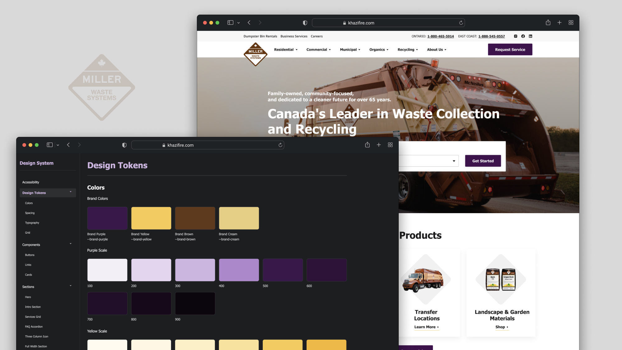
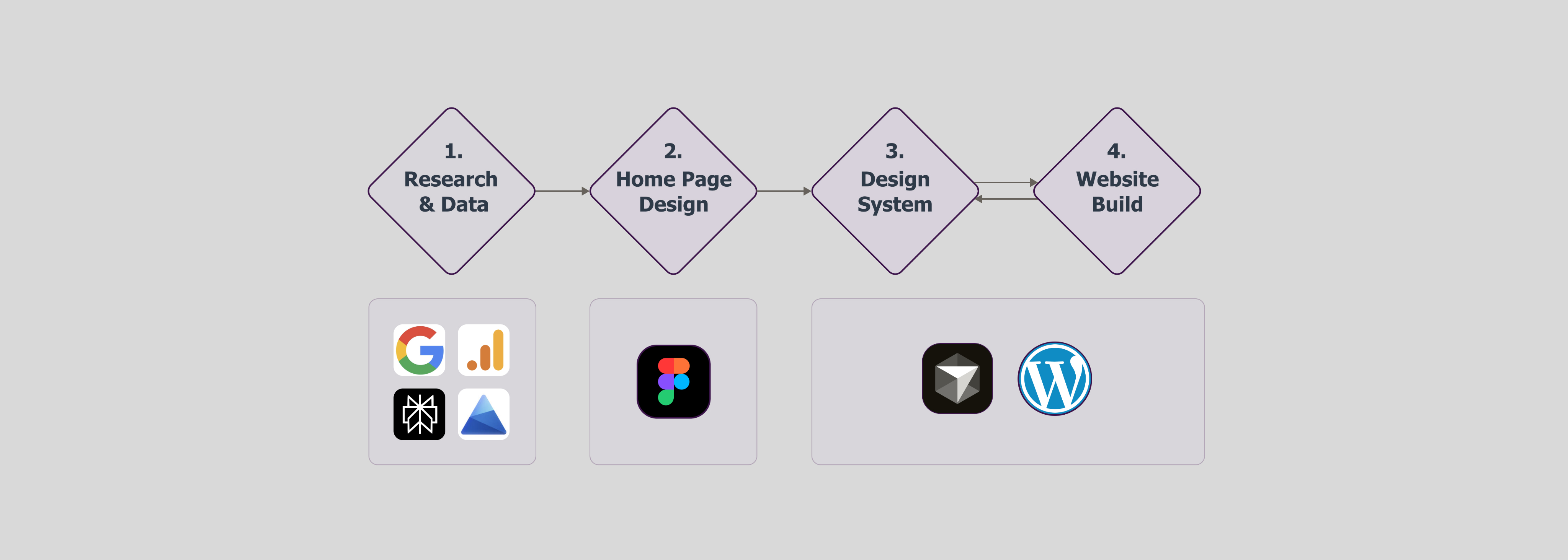
First, I designed the custom homepage in Figma to establish the visual direction and gather client feedback. The client’s decision was to maintain existing structure of the website and its’ pages, so I moved straight into design system creation & development process skipping design in Figma. For the development process, I chose Tailwind CSS design system for several reasons. Firstly, its integration with PHP-based WordPress made it a natural choice—unlike React-based frameworks, which aren’t natively compatible. Secondly, it provides full control over styling, which was important for maintaining the brand’s look and feel. Thirdly, Tailwind keeps file sizes small, improving performance and supporting better SEO rankings. Lastly, it functions as a built-in design system, offering a clear, flexible, and scalable structure across files.
Implementation
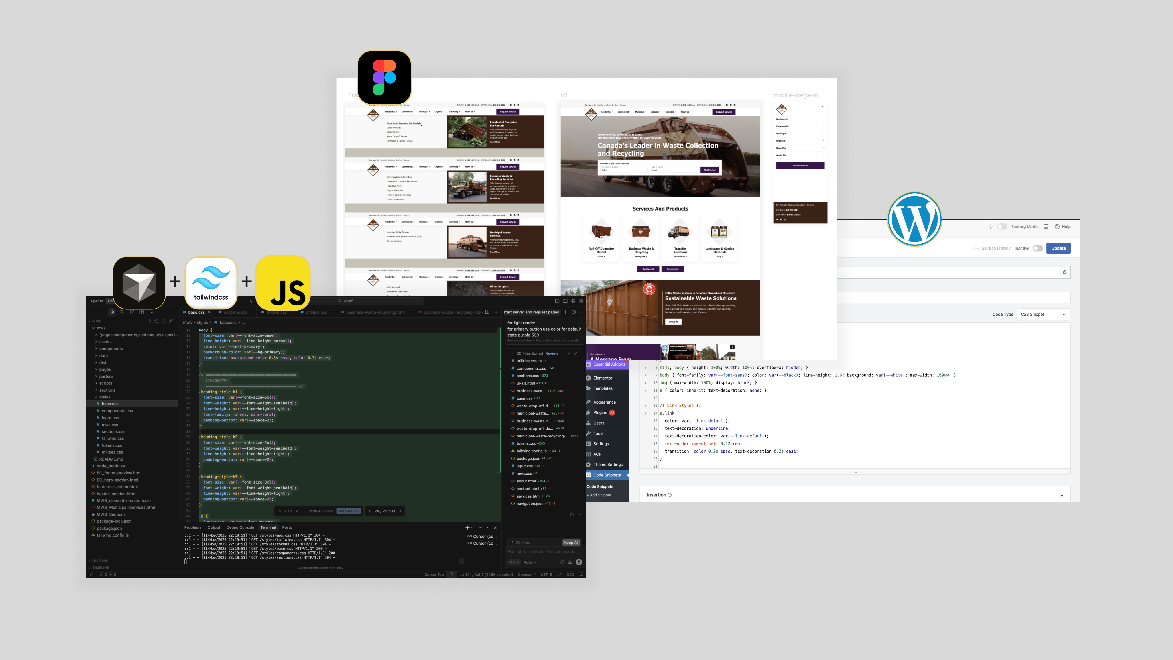
The next step was to take the code created in Cursor and implement it in WordPress. The client requested that the site be updated page by page, starting with the most visited “core pages.” For this reason, I integrated the new code directly into the existing WordPress theme files—cleanly and without conflicts.
Throughout the project, I collaborated closely with the client, project manager, and outsource developer, using short sprints to deliver increments and align design goals with technical feasibility, maintaining an agile workflow that kept the process fast and adaptive.
Iteration & Testing
Component Refinement Across Iterations
As the design system evolved through collaborative input and ongoing client iterations, I focused on maintaining structural consistency—continuously refining components to ensure coherence across changing requirements.
The Impact
A System Built to Evolve
Key outcomes
- 20+ responsive pages built from reusable components
- Reduced time-to-publish for new and updated content
- Improved accessibility and SEO via clearer hierarchies and semantic structure
- Unified brand experience across all service areas
The new website established a cohesive, scalable foundation for Miller Waste’s digital presence—making future development faster and more predictable while preserving brand consistency.se.
The redesign delivered immediate improvements and a long-term framework that simplifies ongoing iteration and growth.
Reflection
Systems, Speed, and Collaboration
This project reinforced the importance of design system thinking in fast-moving, content-heavy environments. Building the system in parallel with the website demanded adaptability, quick problem-solving, and continuous collaboration in the team.
Using tools like Cursor, Terminal, Claude helped streamline the workflow—bridging design and code in real time and freeing up space to focus on structure, scalability, and long-term maintainability instead of repetitive tasks.
Looking ahead, the next step would be to generate documention the design system, turning it into a shared resource that can be used by anyone across teams.

Designing for a Growing Environmental Brand
Miller Waste Systems, a leading Canadian environmental services company, set out to rebrand its website to better communicate who they are and the range of services they provide—from waste collection and recycling to environmental stewardship across Canadian communities.
Early in the project, I recognized that a one-time redesign wouldn’t support the company’s ongoing growth. To enable flexibility and consistency, I defined and built a modular design system—a scalable framework that allowed the website to expand and evolve with the business.
The Challenge
Shaping the System in Real Time
The project required an agile design and development approach, where components and page patterns were created, tested, and refined in real time.
The client requested that the new site be developed on WordPress, the platform already used for company’s other digital products, which brought structural and technical constraints.
The core challenge was to build the website and its design system simultaneously—ensuring each component was reusable, accessible, and scalable while maintaining a cohesive user experience throughout the process.
My Role
How I Drove the Design and Build
I worked as the designer and front-end developer, responsible for shaping both the visual and technical execution of the website. I defined the visual direction, built the design system, and developed responsive layouts directly in Cursor using Tailwind CSS.
Collaboration was a key part of the process—I worked closely with the client, project manager, and backend developer to align design goals with technical feasibility while maintaining agile approach delivering increments and iterating on the results.
I focused on building a scalable and balanced system that kept the design consistent, performed well, and fit seamlessly within the existing WordPress environment.
Understand
Identifying User Friction Through Research
I began with a competitive review of leading environmental and service-industry websites to understand how others guided users through complex information and service offerings.
The research revealed recurring patterns—dense layouts, unclear hierarchies, and limited accessibility—often making it difficult for users to find what they needed quickly. Combined with heatmap analysis and on-site analytics, we saw that many visitors dropped off before completing key actions such as cart drop off. This pointed to navigation friction and poor content prioritization rather than a lack of user intent.
These insights shaped the project’s direction toward clarity and accessibility—a simpler navigation model, more focused content structure, and a visual system that is clean, trustworthy, and approachable.
Strategy & Process
System Creation and End-to-End Implementation
Creation
First, I designed the custom homepage in Figma to establish the visual direction and gather client feedback. The client’s decision was to maintain existing structure of the website and its’ pages, so I moved straight into design system creation & development process skipping design in Figma. For the development process, I chose Tailwind CSS design system for several reasons. Firstly, its integration with PHP-based WordPress made it a natural choice—unlike React-based frameworks, which aren’t natively compatible. Secondly, it provides full control over styling, which was important for maintaining the brand’s look and feel. Thirdly, Tailwind keeps file sizes small, improving performance and supporting better SEO rankings. Lastly, it functions as a built-in design system, offering a clear, flexible, and scalable structure across files.
Implementation
The next step was to take the code created in Cursor and implement it in WordPress. The client requested that the site be updated page by page, starting with the most visited “core pages.” For this reason, I integrated the new code directly into the existing WordPress theme files—cleanly and without conflicts.
Throughout the project, I collaborated closely with the client, project manager, and outsource developer, using short sprints to deliver increments and align design goals with technical feasibility, maintaining an agile workflow that kept the process fast and adaptive.
Iteration & Testing
Component Refinement Across Iterations
As the design system evolved through collaborative input and ongoing client iterations, I focused on maintaining structural consistency—continuously refining components to ensure coherence across changing requirements.
The Impact
A System Built to Evolve
Key outcomes
- 20+ responsive pages built from reusable components
- Reduced time-to-publish for new and updated content
- Improved accessibility and SEO via clearer hierarchies and semantic structure
- Unified brand experience across all service areas
The new website established a cohesive, scalable foundation for Miller Waste’s digital presence—making future development faster and more predictable while preserving brand consistency.se.
The redesign delivered immediate improvements and a long-term framework that simplifies ongoing iteration and growth.
Reflection
Systems, Speed, and Collaboration
This project reinforced the importance of design system thinking in fast-moving, content-heavy environments. Building the system in parallel with the website demanded adaptability, quick problem-solving, and continuous collaboration in the team.
Using tools like Cursor, Terminal, Claude helped streamline the workflow—bridging design and code in real time and freeing up space to focus on structure, scalability, and long-term maintainability instead of repetitive tasks.
Looking ahead, the next step would be to generate documention the design system, turning it into a shared resource that can be used by anyone across teams.
Designing for a Growing Environmental Brand
Miller Waste Systems, a leading Canadian environmental services company, set out to rebrand its website to better communicate who they are and the range of services they provide—from waste collection and recycling to environmental stewardship across Canadian communities.
Early in the project, I recognized that a one-time redesign wouldn’t support the company’s ongoing growth. To enable flexibility and consistency, I defined and built a modular design system—a scalable framework that allowed the website to expand and evolve with the business.
The Challenge
Shaping the System in Real Time
The project required an agile design and development approach, where components and page patterns were created, tested, and refined in real time.
The client requested that the new site be developed on WordPress, the platform already used for company’s other digital products, which brought structural and technical constraints.
The core challenge was to build the website and its design system simultaneously—ensuring each component was reusable, accessible, and scalable while maintaining a cohesive user experience throughout the process.
My Role
How I Drove the Design and Build
I worked as the designer and front-end developer, responsible for shaping both the visual and technical execution of the website. I defined the visual direction, built the design system, and developed responsive layouts directly in Cursor using Tailwind CSS.
Collaboration was a key part of the process—I worked closely with the client, project manager, and backend developer to align design goals with technical feasibility while maintaining agile approach delivering increments and iterating on the results.
I focused on building a scalable and balanced system that kept the design consistent, performed well, and fit seamlessly within the existing WordPress environment.
Understand
Identifying User Friction Through Research
I began with a competitive review of leading environmental and service-industry websites to understand how others guided users through complex information and service offerings.
The research revealed recurring patterns—dense layouts, unclear hierarchies, and limited accessibility—often making it difficult for users to find what they needed quickly. Combined with heatmap analysis and on-site analytics, we saw that many visitors dropped off before completing key actions such as cart drop off. This pointed to navigation friction and poor content prioritization rather than a lack of user intent.
These insights shaped the project’s direction toward clarity and accessibility—a simpler navigation model, more focused content structure, and a visual system that is clean, trustworthy, and approachable.
Strategy & Process
System Creation and End-to-End Implementation
Creation
First, I designed the custom homepage in Figma to establish the visual direction and gather client feedback. The client’s decision was to maintain existing structure of the website and its’ pages, so I moved straight into design system creation & development process skipping design in Figma. For the development process, I chose Tailwind CSS design system for several reasons. Firstly, its integration with PHP-based WordPress made it a natural choice—unlike React-based frameworks, which aren’t natively compatible. Secondly, it provides full control over styling, which was important for maintaining the brand’s look and feel. Thirdly, Tailwind keeps file sizes small, improving performance and supporting better SEO rankings. Lastly, it functions as a built-in design system, offering a clear, flexible, and scalable structure across files.
Implementation
The next step was to take the code created in Cursor and implement it in WordPress. The client requested that the site be updated page by page, starting with the most visited “core pages.” For this reason, I integrated the new code directly into the existing WordPress theme files—cleanly and without conflicts.
Throughout the project, I collaborated closely with the client, project manager, and outsource developer, using short sprints to deliver increments and align design goals with technical feasibility, maintaining an agile workflow that kept the process fast and adaptive.
Iteration & Testing
Component Refinement Across Iterations
As the design system evolved through collaborative input and ongoing client iterations, I focused on maintaining structural consistency—continuously refining components to ensure coherence across changing requirements.
The Impact
A System Built to Evolve
The new website established a cohesive, scalable foundation for Miller Waste’s digital presence—making future development faster and more predictable while preserving brand consistency.se.
Key outcomes
- 20+ responsive pages built from reusable components (to be published currently)
- Reduced time-to-publish for new and updated content
- Improved accessibility and SEO via clearer hierarchies and semantic structure
- Unified brand experience across all service areas
The redesign delivered immediate improvements and a long-term framework that simplifies ongoing iteration and growth.
Reflection
Systems, Speed, and Collaboration
This project reinforced the importance of design system thinking in fast-moving, content-heavy environments. Building the system in parallel with the website demanded adaptability, quick problem-solving, and continuous collaboration in the team.
Using tools like Cursor, Terminal, Claude helped streamline the workflow—bridging design and code in real time and freeing up space to focus on structure, scalability, and long-term maintainability instead of repetitive tasks.
Looking ahead, the next step would be to generate documention the design system, turning it into a shared resource that can be used by anyone across teams.